
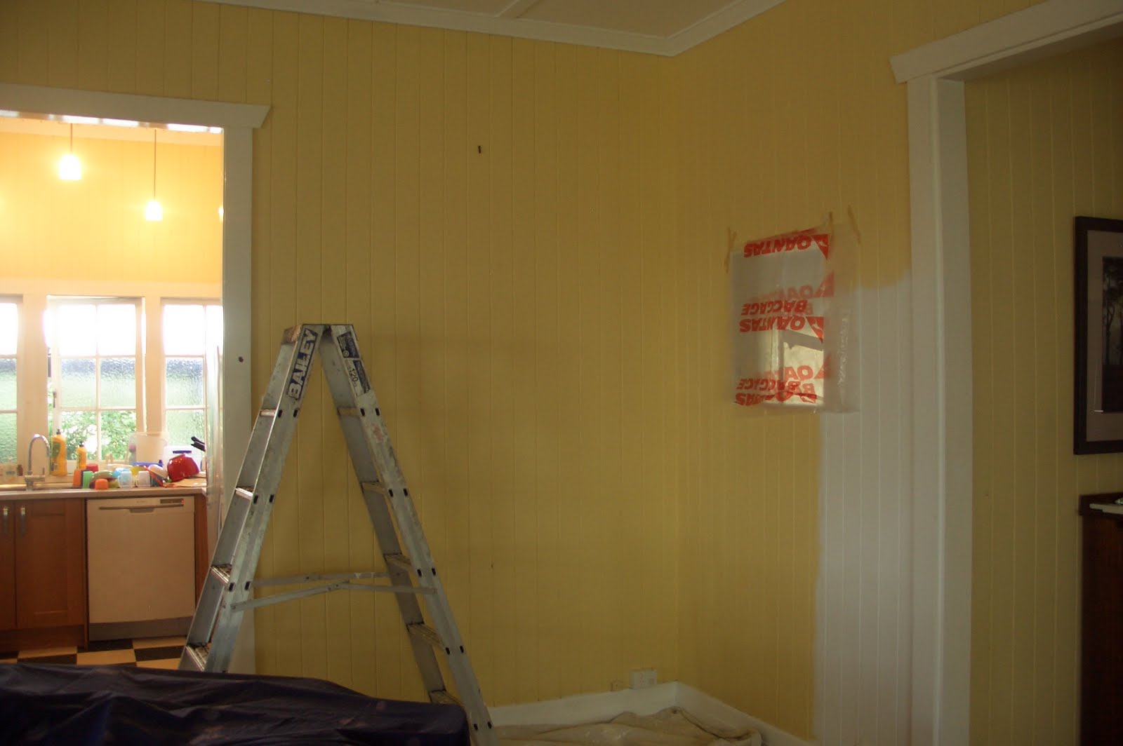
Well, Betsy and I are very excited to announce that the Great Custard Purge of 2011 has begun. Here is a before shot to truly capture how much custard we are swimming in every day. Note the fastidious preparation of dropsheet on floor, sheet on precious new silky oak table and plastic over the peekaboo window into our bedroom.
Completely out of character but necessary as I could hear Legoman's voice in my head as I was about to do my usual slapdash approach to preparation. Actually, he did suggested the plastic over the peekaboo window to protect our bed but this of course was complete overkill as I am quite a tidy painter. Took it down as soon as
It recently dawned on me that it is almost a year to a day to when we first met Betsy and placed a contract to buy her. And even allowing for the 3 month settlement that means that we have been living with the custard trifle for 9 months. With some sunny weather and Legoman at home to play with the kids, it was time to make a start.
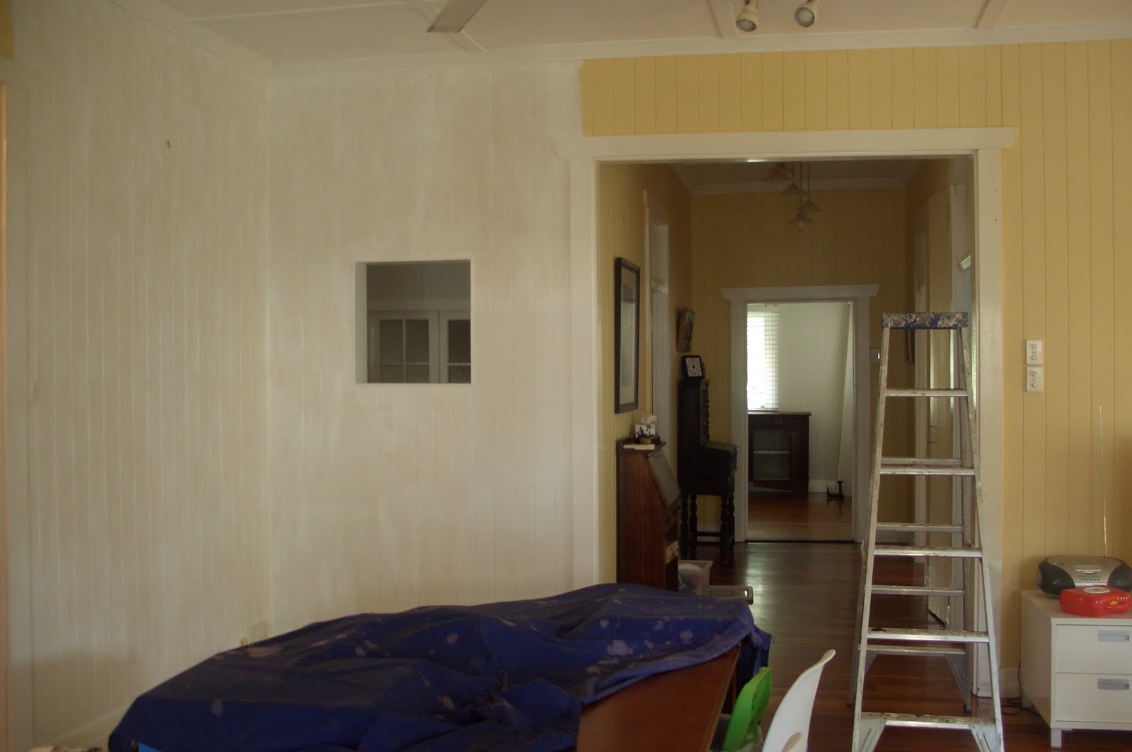
Goodness, isn't that a wonderful sight? And that's just the undercoat. Looking up through Betsy's super deluxe awesome hallway towards the front of the house. Betsy has been generously gifted an ample 1.8 m diameter hallway and it was one of the first things that made me swoon upon meeting her.
There is has been significant pontificating over the ideal white paint. Four sample pots seems to be pretty standard for me. I wanted a warmish white which was not showing obvious yellow or grey or peach hues. I quite like plain Vivid white but as our lounge is north facing thought it could be just a bit too bright. White on white was a little too stark/blueish, Whisper white a little too greyish. So Dulux Natural white it seems to be.
To me it looks just like the white of a full cream milk. Nice and rich but no hints of blue (skim) or yellow (cream). Or perhaps even a bit like a polar bear- they look white until they are standing on the snow and then you notice they are actually creamy coloured. Great thanks to the gods of daytime naps who kept my 2 year old asleep for two whole hours while I slapped the final coat on today.

I'm hoping to have this corner of milky goodness knocked over and dressed up by tomorrow. Apologies for the poor photo but with the flash it was blinding. Embarrassingly, I have been choosing seating positions at the table and on the lounge in order to gaze only into this corner. Children have been getting limited eye contact as well.
Lots more to share soon. Some vintage finds and a cast iron bed for Liongirl. Just too much painting (and singing cause that's how good painting makes me feel) for any photos to be taken.
I you to channel a bit of your white-vibes over this way. I am WAAAAAY too impatient and indifferent to buy sample pots. We recently grabbed a white at the hardware store, painted the whole 3rd floor. Stood back and said, "oooh, looks really gray..." Same for part of the first floor, we picked up a different white and finished up two huge rooms, stood back and went "erk, looks like a touch of lavender.." We haven't done most of our living spaces yet though, and I am wondering what kind of white to get next! But go to the hardware and deliberate over the paint pots? Um.... nope, sorry, too hard and time consuming! Might just resort to non-tinted standard white white. Maybe its what we've been looking for all along.
ReplyDeleteI like your painting, btw. And your preparation. Although must say that in the photos the custard doesn't look bad either. Not bad at all!
Had to laugh as we have a very similar yellow in our house. Ours is called Citronella. I really liked it 10 years ago when we bought the house and did repaint the same colour about 5 years ago. Since then we have been waiting for our extension before we do any more painting. We recently ended up painting our lounge room because we got sick of waiting and it looks great. Master M is very disappointed as his favourite colour is yellow and has asked that we go back to that colour. LOL I told him he can keep the yellow in his room. Your walls are looking great!
ReplyDeleteFinding the perfect white is always a challenge. It looks fantastic and is a huge improvement on the yellow.
ReplyDeleteHa! I can totally relate to this. We've been gazing adoringly at our walls too. It looks great. xx
ReplyDeleteA simple coat of paint does wonders... looking forward to the before and afters... gxo
ReplyDeletegoodbye custard! although i'm more of a soy milk kinda girl, i'm really loving this full cream approach! your posts are so delightfully entertaining. can't wait to see it as it develops further. have a wonderful thursday lovely lady. xx
ReplyDeleteBeautiful. We have custard with red wine jelly trim. Delightful, it kinda makes me throw up a little when I change rooms :)
ReplyDeleteyay for creamy white, it is going to transform your interior!
ReplyDeleteOOOh I used to love the custard colour alot, it was high fashion back in the 90's!!!
ReplyDeleteIt is looking lovely already!!
Good bye custard hello lovely fresh white. It's hard choosing paint colours isn't it? I ended up choosing natural white for the ceiling in our office, it's a lovely shade of white. The painting is looks great.xo
ReplyDeleteGoodbye custard! I hope you are as happy with your NW as I am with mine. I KNOW you will be.
ReplyDeleteThanks all for the moral support in the great custard purge.
ReplyDeleteMook, plain vivid white is lovely, would probably enhance your winter light.The one I have picked has a tiny bit of black and umber if that helps.
Hello vintage- Roboboys favourite was also yellow for everything age 2-4, has now moved onto orange.
Brismod- looking at your walls has got me through the last 9 months
Kit- we do alot of rice milk around here, don't even involve soy milk as a colour- I think we have that currently in our bedrooms aka 1/4 hog bristle- it will be going next.
Timber and tin- your colour combo definitely outpips custard and dirty cornflower blue
Oliveandesther- I think I actually chose this colour to repaint the kitchen in my first rented sharehouse back in 1996= to compliment the retro orange benches!and the landlord agreed and supplied the paint!
Karlyn= can't wait to see the half strength version